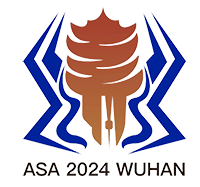


亚洲蛛形学会2024武汉会议会徽的整体造型灵感来源于敬钊缨毛蛛,致敬湖北大学赵敬钊教授对中国蛛形学的巨大贡献,也凸显此次会议的主题-蛛形动物。会徽之中心是武汉代表性建筑黄鹤楼的剪影,黄鹤楼剪影下方是武汉标志性建筑-世贸中心、龟山电视塔和武汉市中心的剪影,两相映衬体现了武汉的历史厚重感和日新月异的飞速发展势头。围绕在这个剪影周围的蓝色弧线是贯穿武汉的长江和汉江,体现了武汉两江三镇之格局与气势。会徽整体采用橙色和靛蓝色,橙色是黄鹤楼的标志性颜色,同时也体现出武汉热情奔放的城市性格,靛蓝色代表两江之水的纯净和深邃,同时也体现了会议的科学性、研究的深入性、理论的纯粹性。会徽采用的两种颜色具有鲜明的对比效果,配合众多的曲线造型,使得整个会徽富有动感和力量感,给人生动活泼的感觉,体现了武汉会议热烈友好之氛围,以及积极进取、不断创新的美好愿景。
Our conference logo is inspired by the shape of the charismatic tarantula spider, Chilobrachys guangxiensis from Hubei Province, serving as a tribute to the remarkable arachnological research by Emeritus Prof. Jingzhao ZHAO at Hubei University. The design also reflects our ASA conference theme—arachnids. At the heart of the logo, you will find the silhouette of the iconic Yellow Crane Tower in Wuhan, flanked by the outlines of the World Trade Center, Mt. Guishan TV Tower, and Wuhan center. These elements collectively symbolize Wuhan’s rich history and dynamic rapid growth. Encircling these icons is a blue arc, representing the Yangtze River and the Han River flowing through Wuhan, highlighting the city’s lively spirit. The logo is presented in vibrant orange and indigo. The vibrant orange, taken from the Yellow Crane Tower, captures Wuhan's lively urban vibe, while the deep indigo signifies the depth and purity of the rivers, emphasizing ASA conference’s scientific focus and the depth of our research. The interplay of these two contrast colors and the flowing curves in the design convey energy and strength, mirroring the warm and friendly atmosphere we aim for at ASA 2024 Wuhan Conference. We hope this logo reflects our positive outlook for progress and continuous innovation.